+ Branding
Good Flyte Brand
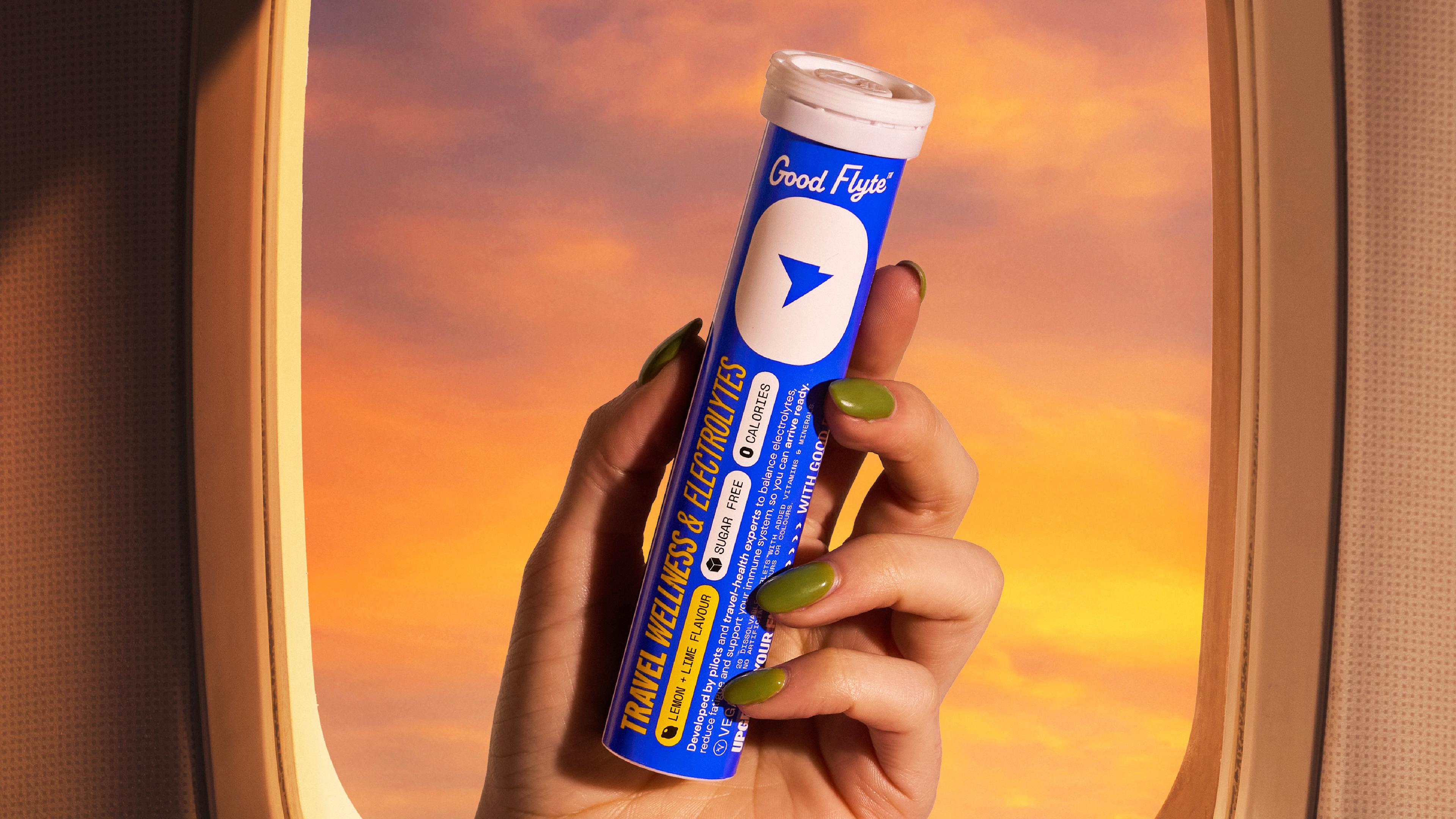
Introducing our branding and packaging design for Good Flyte: a supplement created specifically for travel. Developed by pilots and travel health experts, it’s formulated to support hydration, reduce fatigue, and strengthen the immune system during long-haul flights, so you can ARRIVE READY. This marks our studio’s second venture into FMCG branding and packaging, a space we’re deeply passionate about.
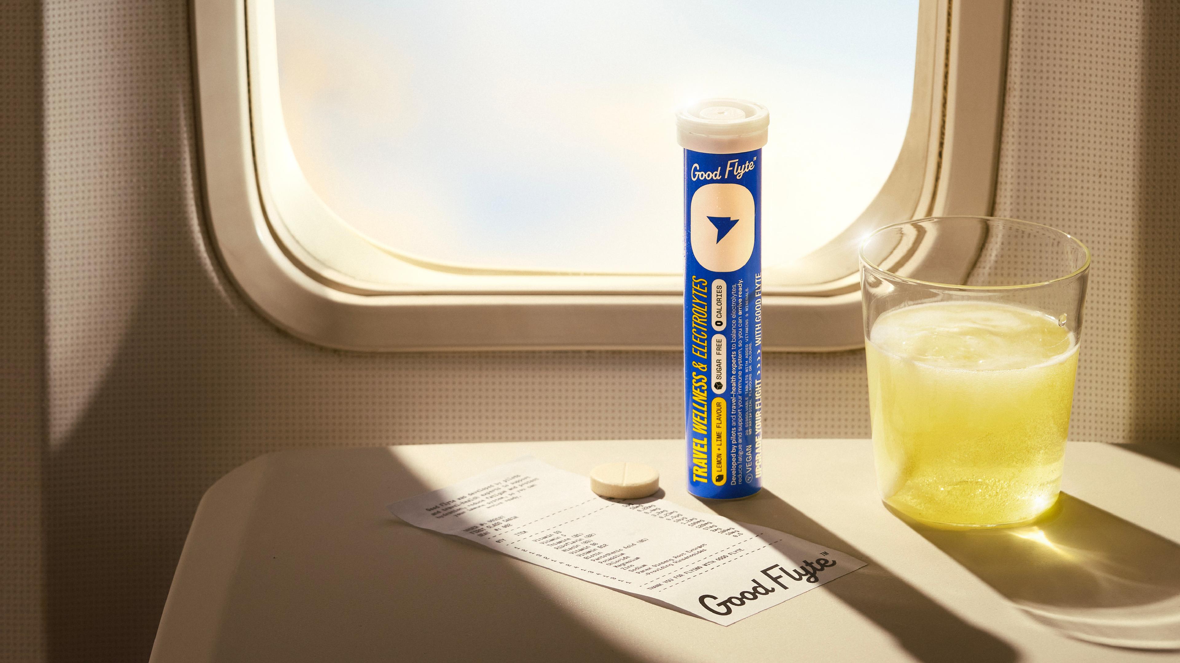
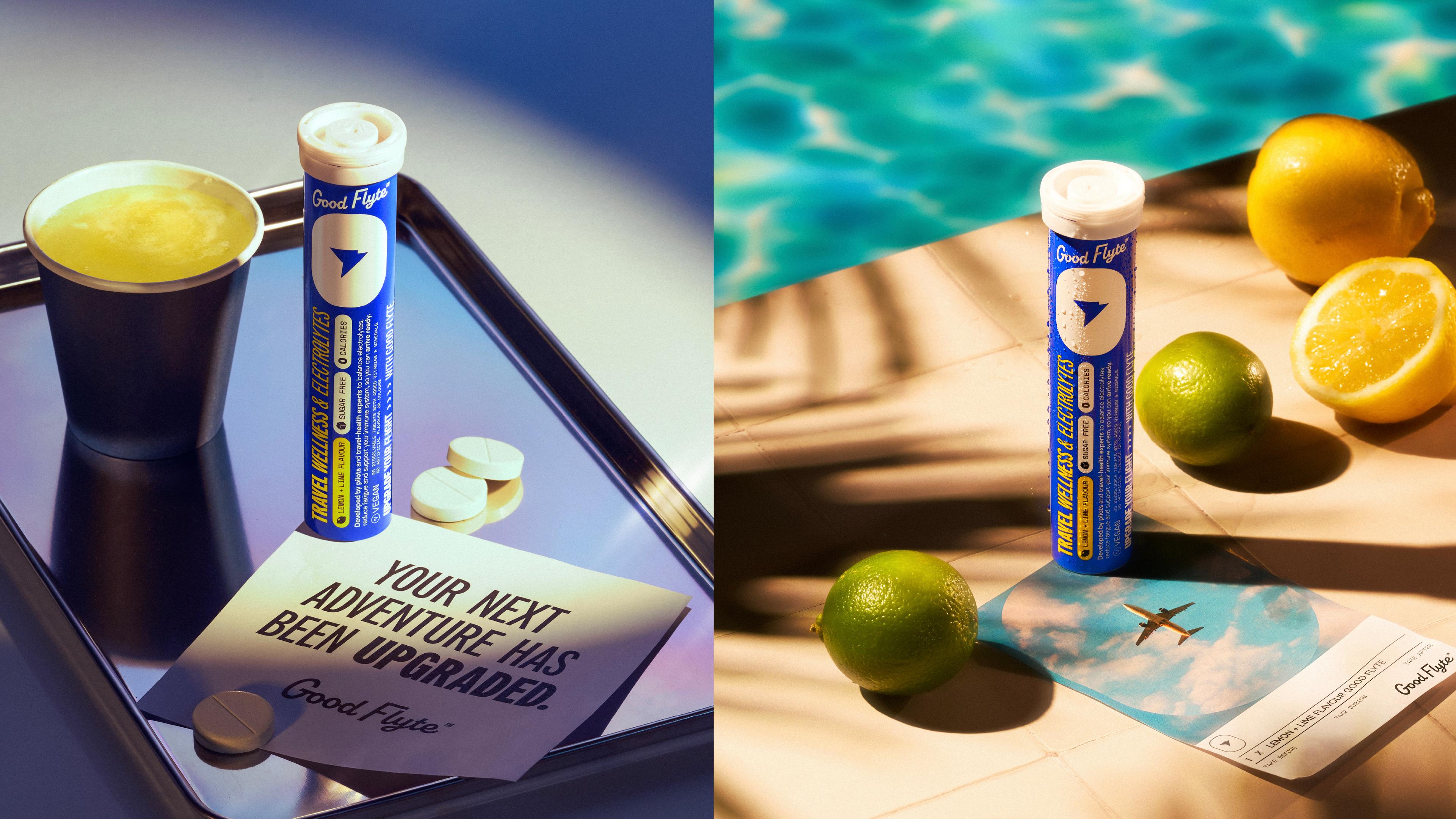
When the team behind the supplement came to us, they were starting completely from scratch. We helped develop the name Good Flyte, then set out to create a retro brand that nods to the golden age of flying. To achieve this, we created a custom logotype with a 60s feel and paired it with a brand mark inspired by a pin you might find on a pilot or cabin crew uniform, all framed within the shape of a plane window. Colour was a big part of the launch. Blue and yellow were chosen to stand apart from competitors, which are often saturated with reds and purples, helping it stand out on shelf and hold its own.
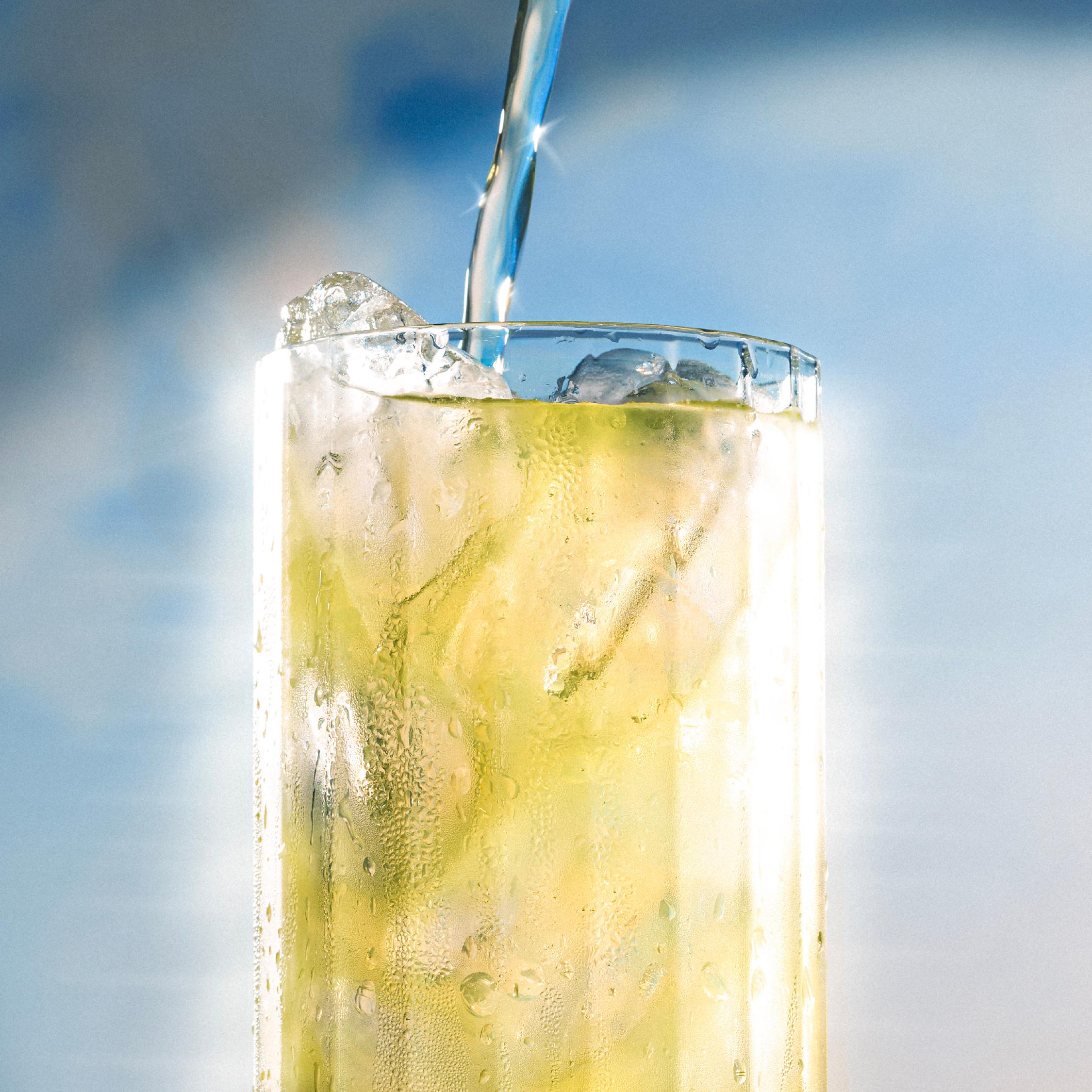
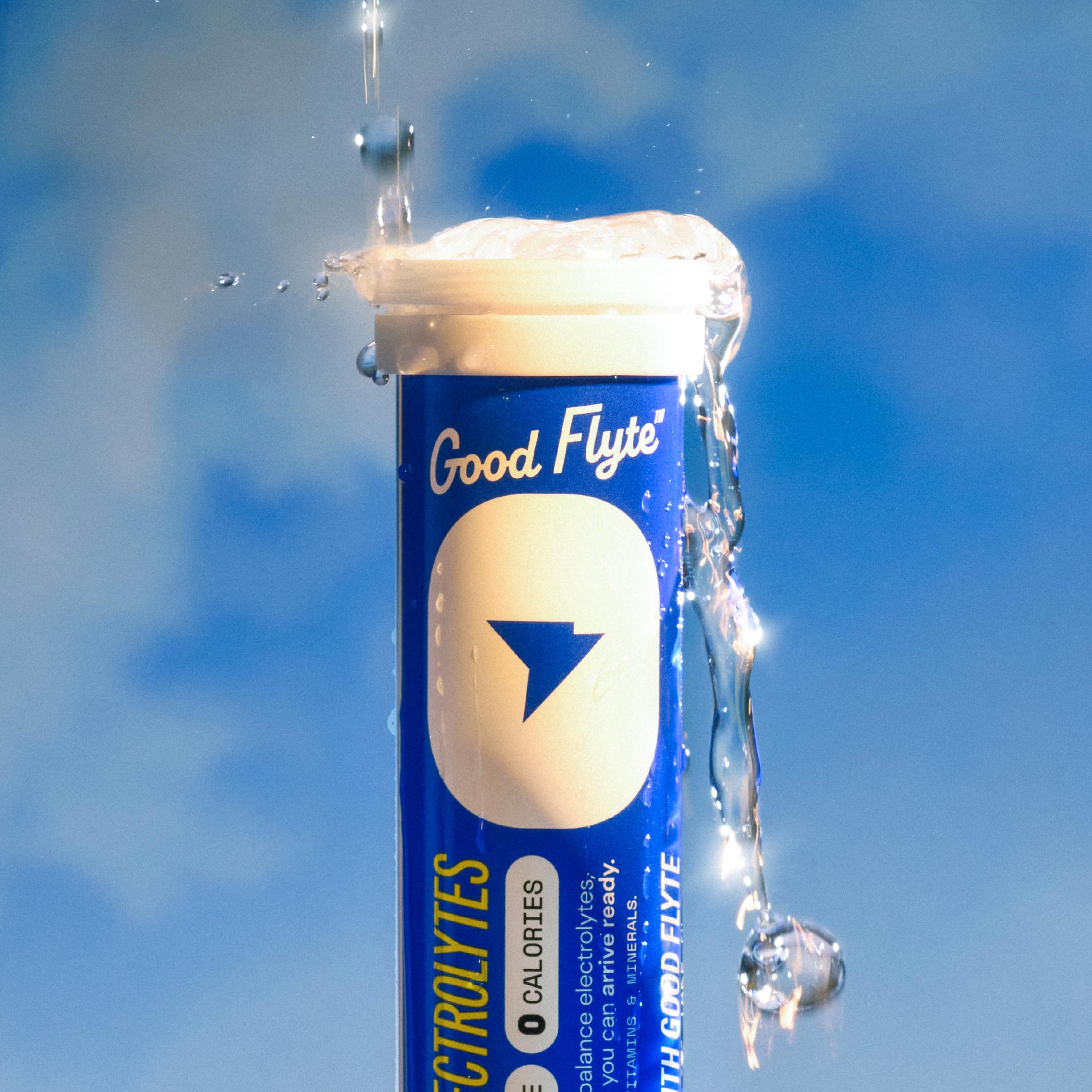
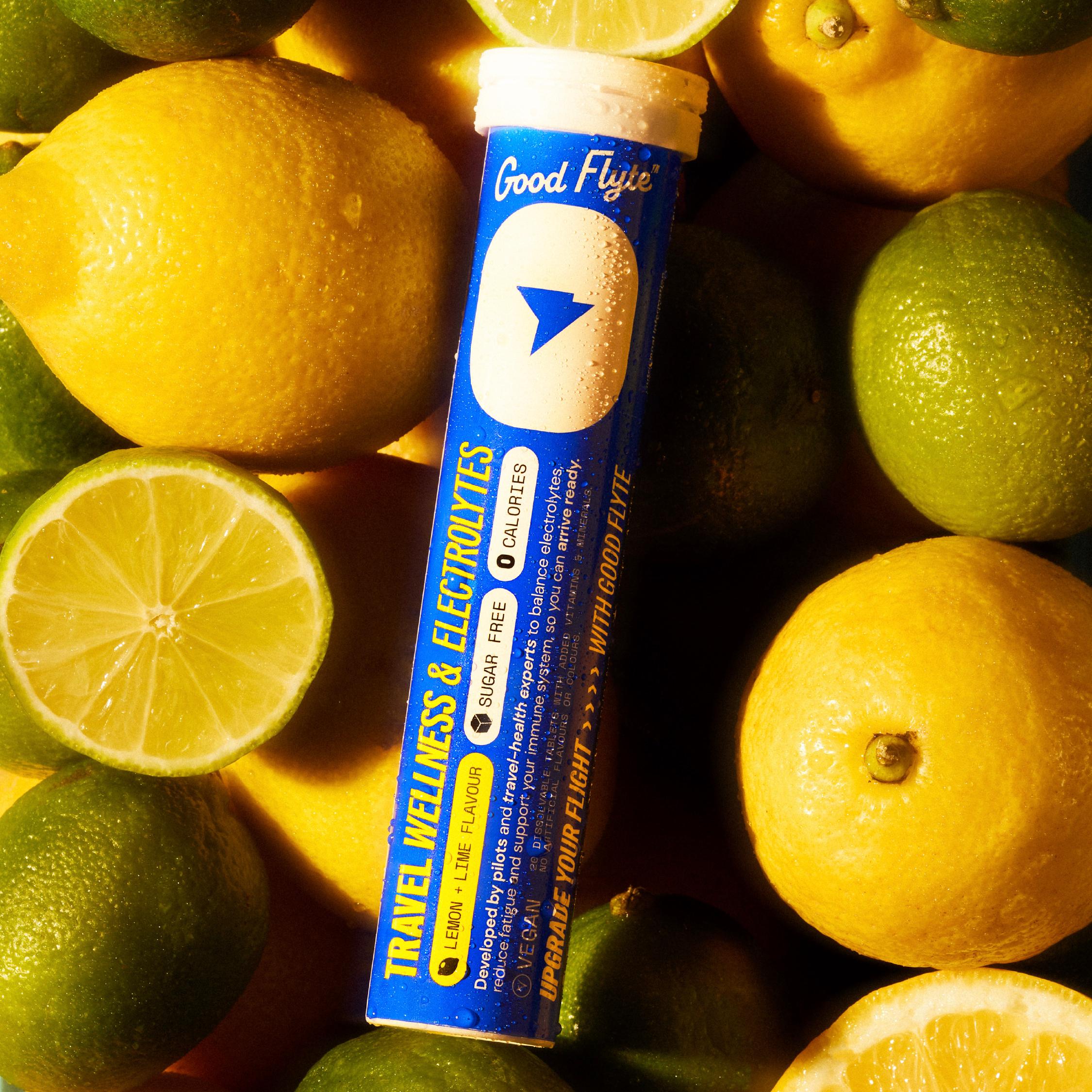
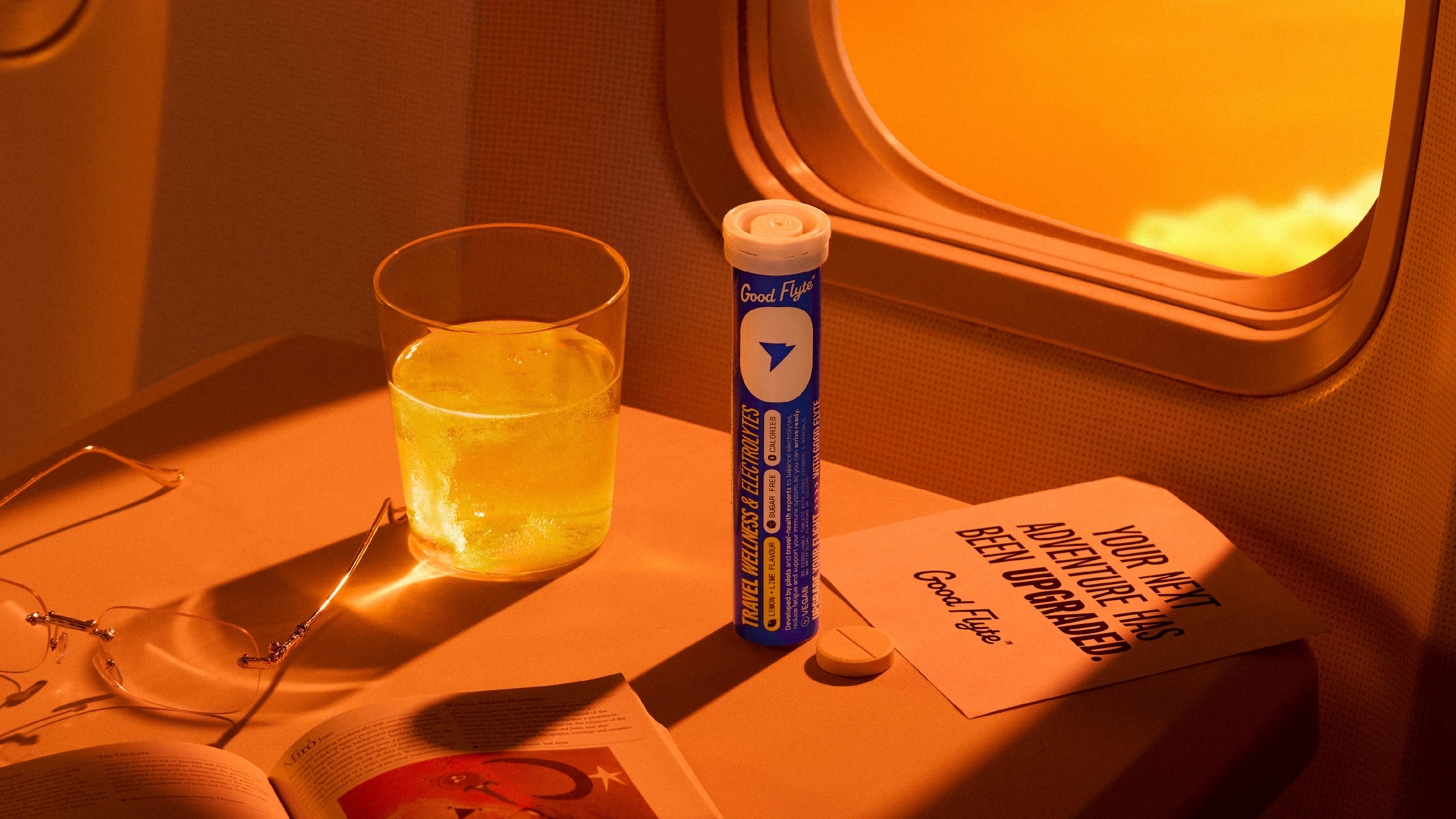
For the photography, we worked with Claire Angel. We wanted to keep everything real and hands-on, so nothing here is AI. We sourced a piece of a plane for the set, which gave us something really unique to work with and made the whole process genuinely fun. Claire experimented with a mix of constant lighting and flash to create a soft, glowy feel, carefully controlling colour temperature across each shot. It gave the work a distinct look that felt considered but still natural. It was a great project to bring to life with people in our creative network, the kind of collaboration that makes the process as enjoyable as the outcome.